64 Old Compton Street
Italian restaurant
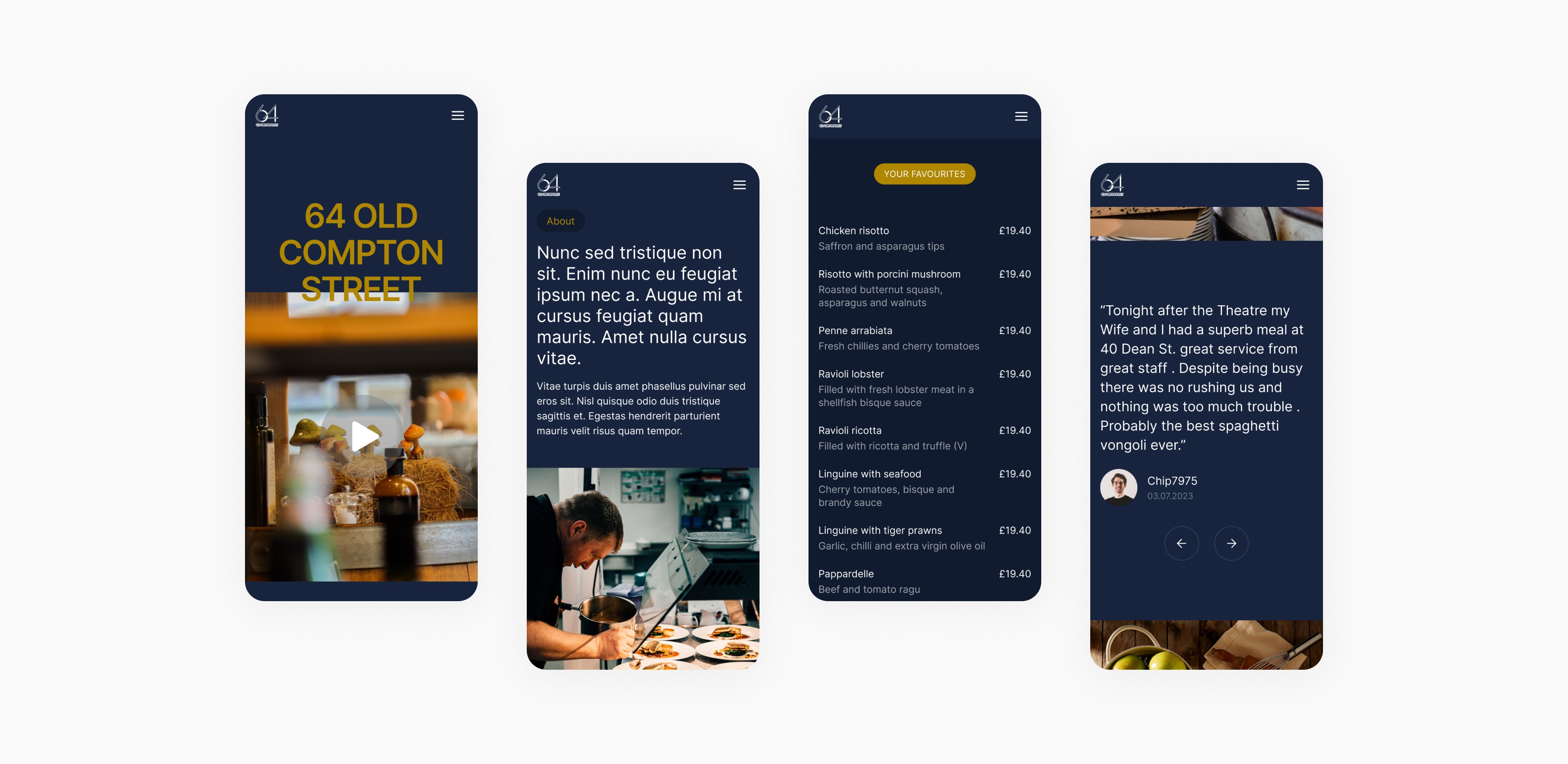
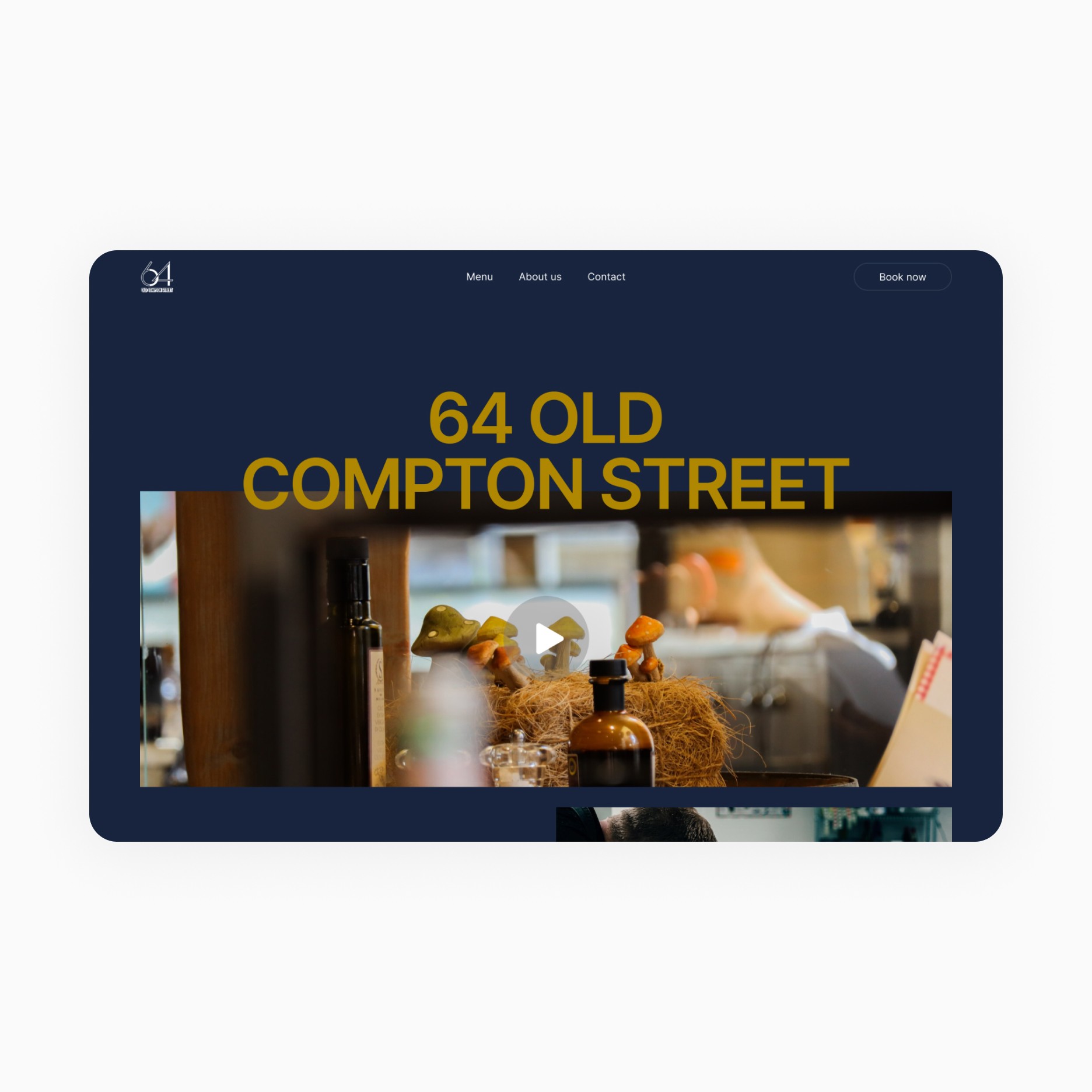
64 Old Compton Street is another new entity from the owner of the 40 Dean Street restaurant in Soho. The intention was to follow the same layout principle to maintain a kind of identity consistency between the two sites for visitors.
Client
40 Dean Street
Services
Web Design
Industries
Catering
Date
May 2023
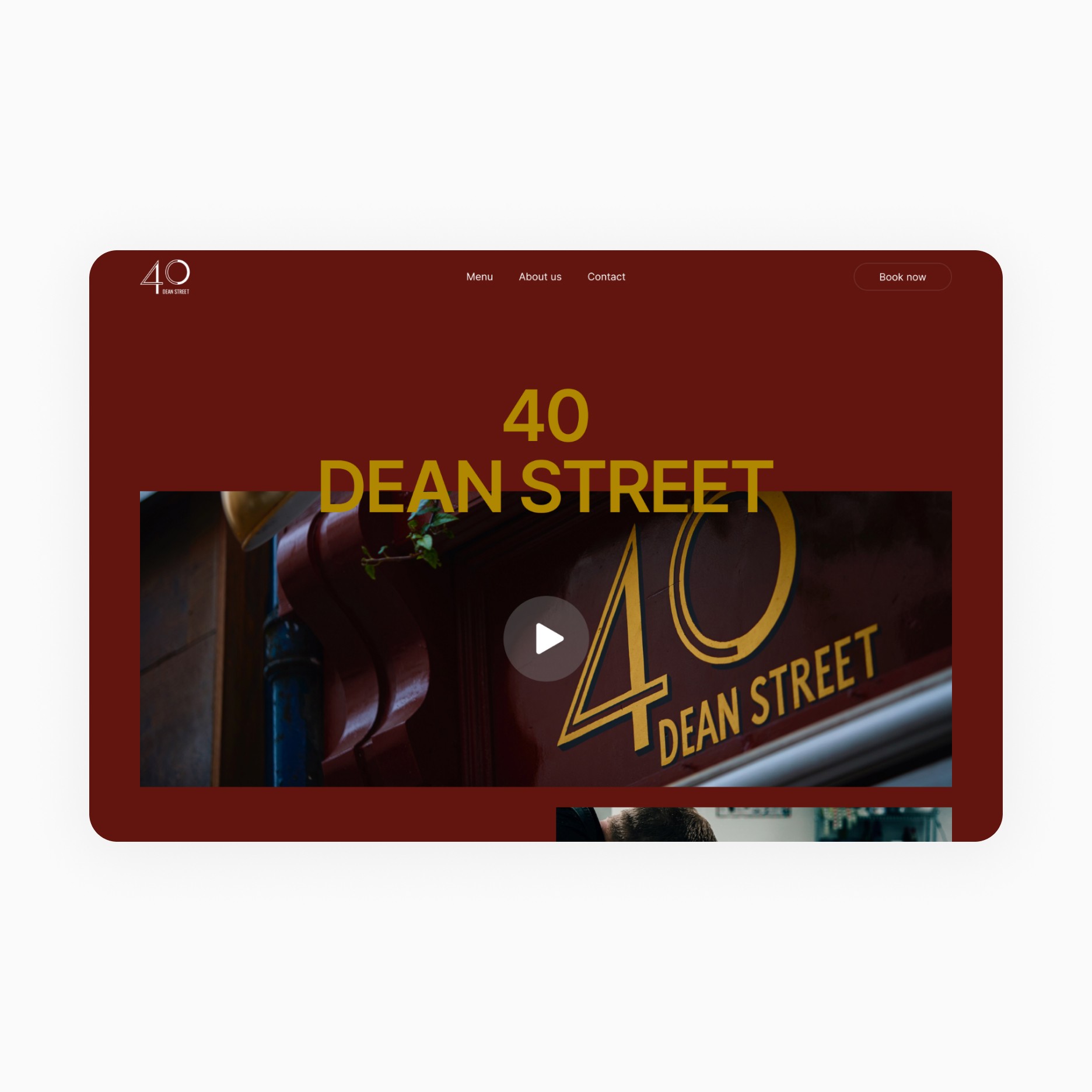
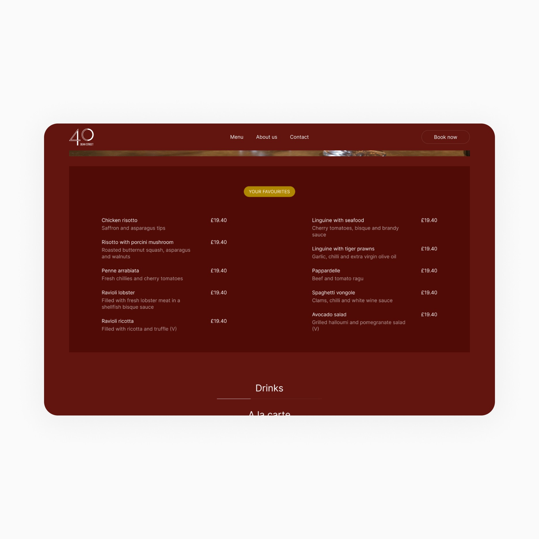
To maintain consistency and storytelling between the two entities, we decided to go for an identical layout. Then, after several iterations, we decided on a plain background to establish the restaurant's identity as soon as it landed on the page. The colours and typography were chosen to highlight the restaurant's identity: simple but elaborate, accessible but gourmet, and timeless.
In the end, to maintain the identity of each site and keep a breadcrumb trail from one to the other, we gave each a different background colour. And so we've given their original sites a redesign too. In the event of other restaurants opening in the future, they will all be linked by this common layout, which will make them instantly recognisable in the minds of visitors but distinguished by the coloured background.


