nüMorning
Give power to the most decisive moment of the day.
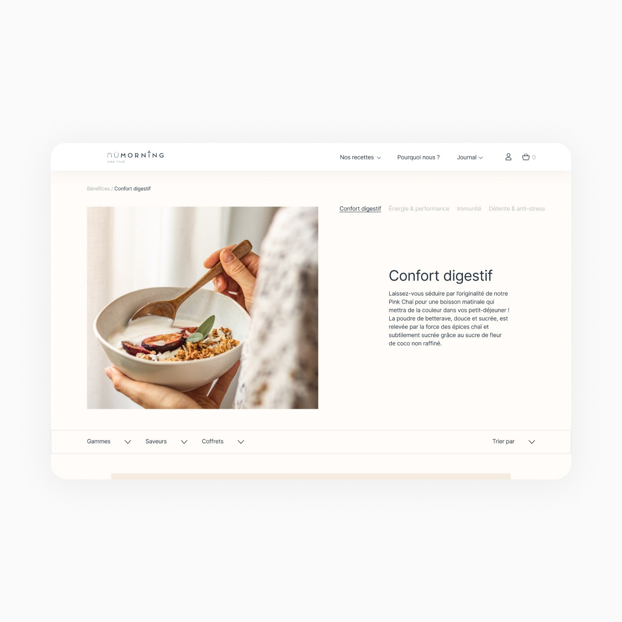
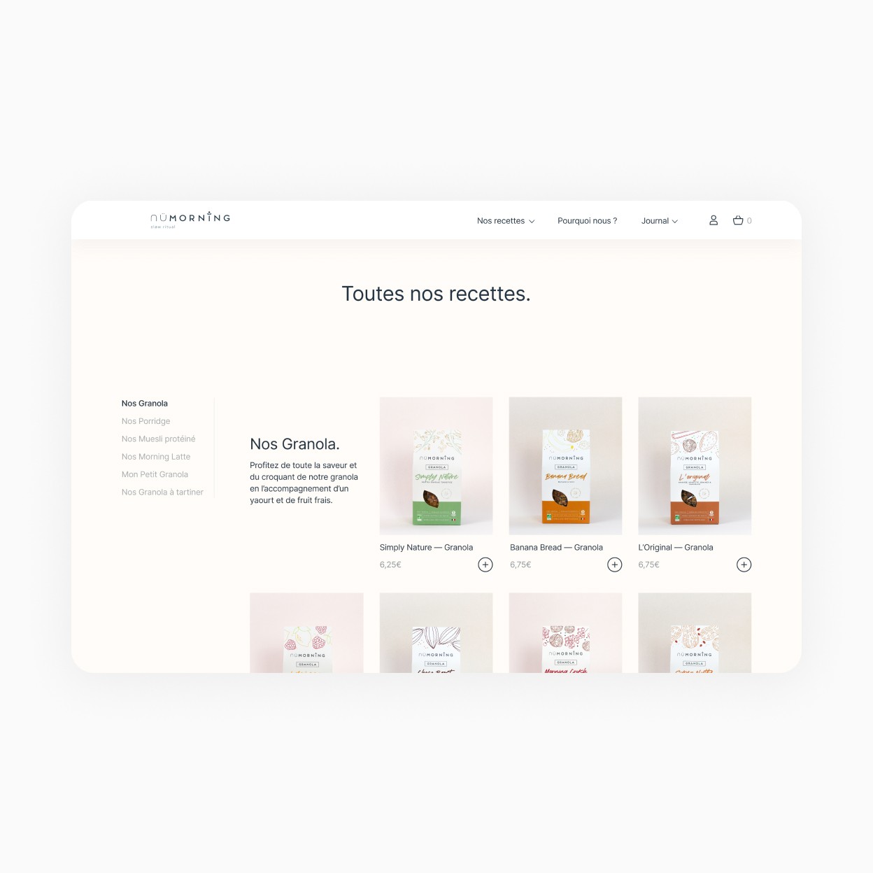
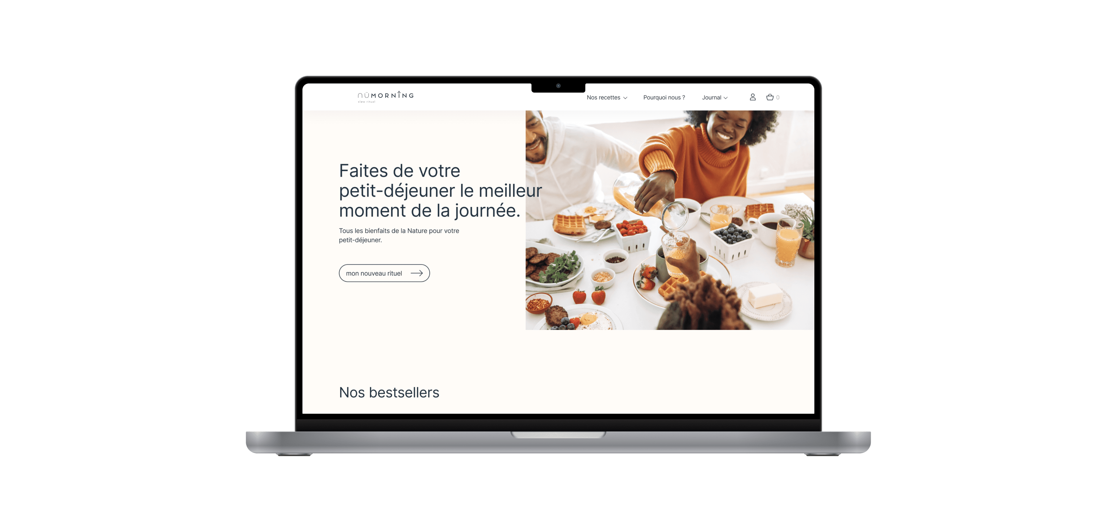
nüMorning is a Lyon-based startup. Their concept is to develop and sell recipes made with oats. The aim: to make consumers adopt and improve the principle of breakfast and snacks that are tasty but above all healthy for the body and for the planet. As the B2B market was settled, they had to develop their B2C market. The project was to redefine the entire user experience and to design the current website.
Client
nüMorning
Services
Web/UX design E-commerce Icones
Industries
Food
Date
2021


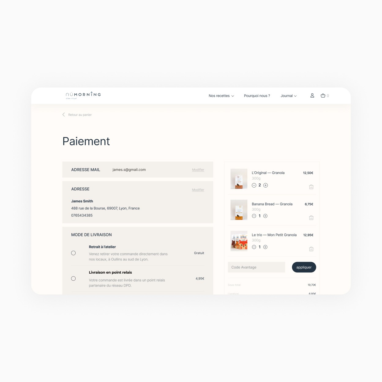
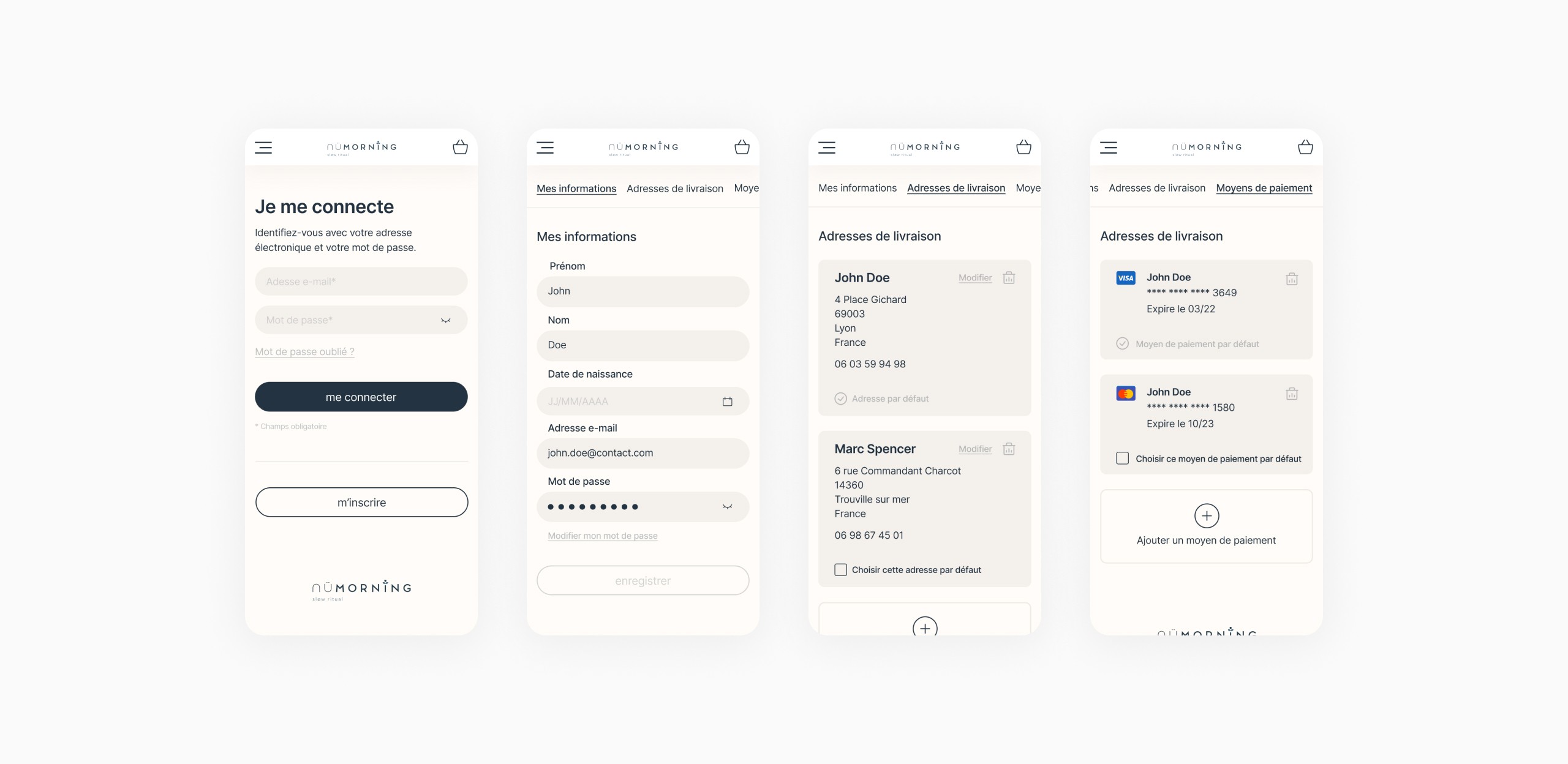
To increase the rate of purchase and improve the user experience, we chose to make the shopping cart a panel. Rather than a new page that would interrupt the user's experience. Which allows users to stay in their path and not be frustrated by having to start over or wait for a page that loads too long.
A simplification of the payment process was greatly needed. Before the redesign, there were 5 steps from the shopping cart to the final payment. Many users were leaving during this process because of the optional information requested and the numerous steps. We managed to increase the number of sales by 30% by creating a single page to switch to this payment, with only the necessary information.